NX Log to Chart Converter
Answered
Hi everyone,
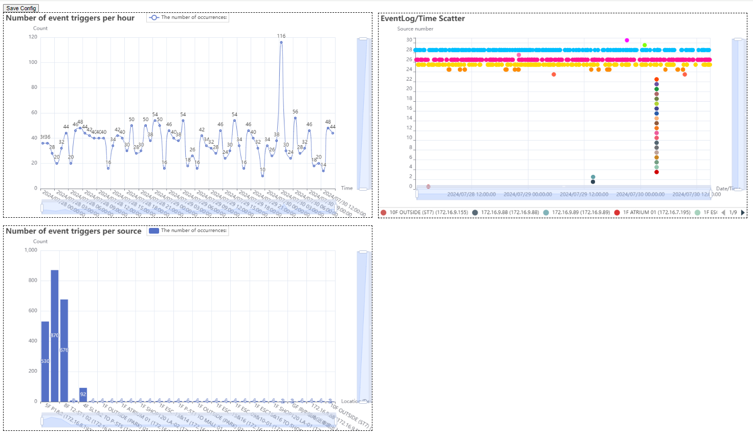
I’ve open-sourced my NX Log to Chart Converter on GitHub! This Python tool transforms NX log HTML files into bar charts and scatter plots to diagnose network issues or visualize data like foot traffic. It’s user-friendly, supports zoomable charts, and helped me spot UPS power issues in a building. Built with pandas, matplotlib, and beautifulsoup4, it also handles API-generated logs for advanced stats (e.g., AI trigger event). Check it out at https://github.com/Wing9897/NX_analysis_3rd, and share feedback or ideas in the repo or via DM!
2
-

This is awesome, superb.
0 -
Thank you for the support!^^
0
Please sign in to leave a comment.
Comments
2 comments